

Pages With Purpose Beat Pages With Stuff
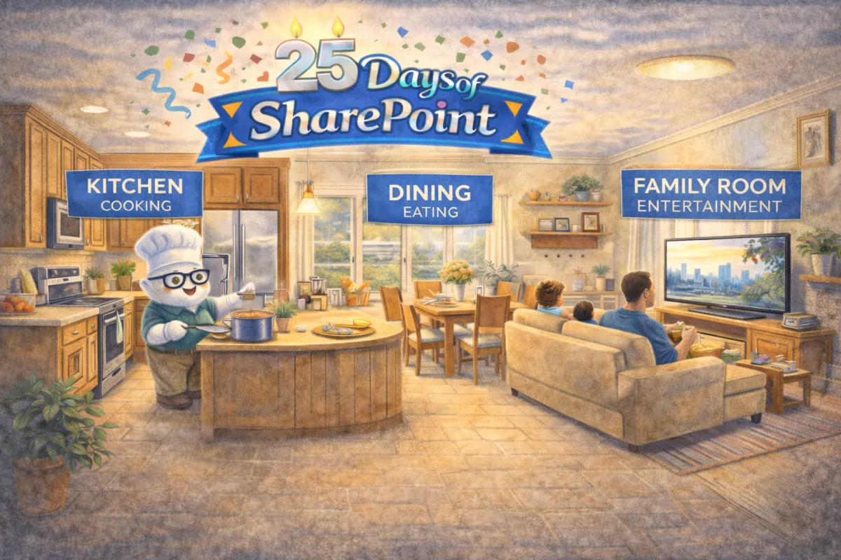
Your guests have walked into the house and now are trying to figure out what is where. They walk into the great room. Is is jumbled mess, or does it have functional spaces for specific activities. Ours has a kitchen (cooking), dining (eating), and family room (entertainment). Your SharePoint pages need the same structure.
Create Zones First: Sections Are Your “Great Room” Layout

Before you add anything to a page, set up the space. Sections are your great room zones: one area for “what’s happening,” another for “what to do next,” another for “resources,” and maybe a small corner for “who to contact.” When you build these zones intentionally, your page becomes easy to scan and predict, which is exactly what busy humans need. Keep it visually digestible by limiting the number of sections, using consistent column layouts across similar pages, and giving each zone a clear purpose so the page feels calm instead of crowded.
Decorate the Zones: Web Parts That Add Interest Without Adding Noise

Once your layout is doing the heavy lifting, web parts become the decor, not the clutter. Use images to create visual breaks and reinforce key messages, Call to Action buttons to guide the next click, and People to make ownership obvious (so users know who to ask without starting an email chain). Add light structure with spacers or dividers so content has breathing room, and consider News or Highlighted Content when you need dynamic updates without constantly redesigning the page. The rule of thumb:
Every web part should earn its spot by helping someone understand, decide, or do something faster.
Built-In Styles: The HOA Rules That Save You From Design Chaos
This is the part where your inner rebel might sigh, but the built-in styles are the reason your site looks like a cohesive neighborhood instead of fifteen houses painted “unique.” Use headings, section styles, and formatting that are already part of the template so your pages stay readable, consistent, and accessible.

What “HOA-approved” formatting gives you:
Consistency across pages (so users don’t have to re-learn the layout every click)
Better accessibility and scanning (especially with headings and clean structure)
Faster page building because you stop reinventing formatting every time
You can absolutely decorate with personality. Just do it with structure, not formatting free-for-all energy.
Ask Yourself
If someone landed on your homepage for the first time, would they immediately know what to do next, or would they need to “explore” like it’s an escape room?
When your pages are designed with purpose, your site gets easier to use, easier to maintain, and a whole lot easier to trust. A clean Hero, well-structured Quick Links, and consistent “HOA-friendly” formatting turn SharePoint from “that place we’re supposed to use” into “the place people actually go first.”
How Can I Help?
If you want a second set of eyes, I can help as your SharePoint Architect, Consultant, or Adoption Specialist. Whether you’re rebuilding a messy homepage, standardizing page layouts, or trying to get users to stop treating SharePoint like a lost and found bin, I can help you create a site that people actually use.
Not sure? Let's Chat!
Pick one thing you can simplify today: your Hero, your Quick Links, or your formatting, then tell me in the comments which one is currently the biggest troublemaker on your site.
#emPOWERd #GirlGeeks #MVPBuzz #M365 #Microsoft #Productivity #SharePoint #SharePointOnline #Intranet #DigitalWorkplace
